Michael Forbis
A collection of things designed for humans.
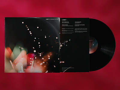
View Lumet - Slumbered Youth Cover
View Mike Dalton, DP
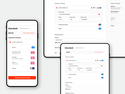
View Checkout Redesign v1
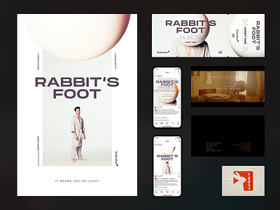
View Rabbit's Foot — Collateral
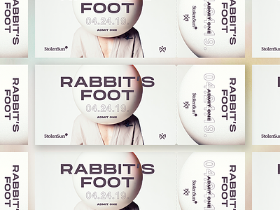
View Rabbit's Foot Premiere Ticket
View Rabbit's Foot - Poster Sketches
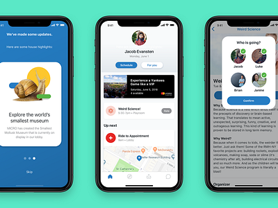
View Together App for Ronald McDonald House New York
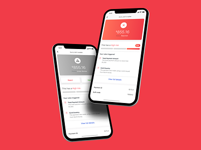
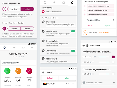
View Reviewing a high risk payment
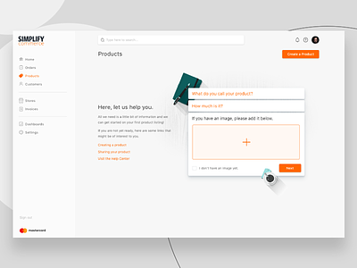
View Creating some consistency
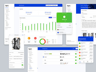
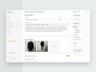
View Merchant Platform Exploration
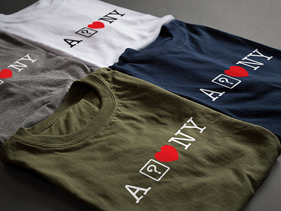
View A ? heart NY
View Empty State Concept
View Fraud Protection App Styles
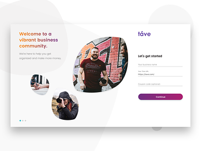
View Táve Signup #dailyui001
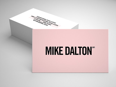
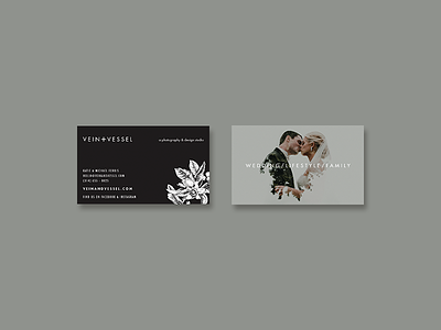
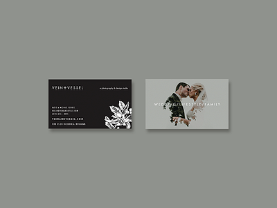
View New Business Card
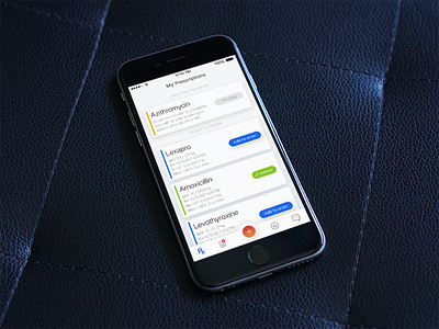
View Prescriptions
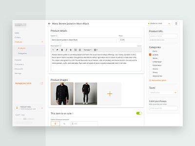
View Portal Redesign
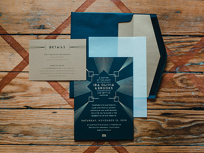
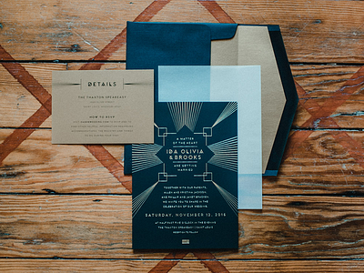
View Wedding Invitations
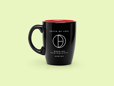
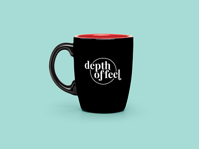
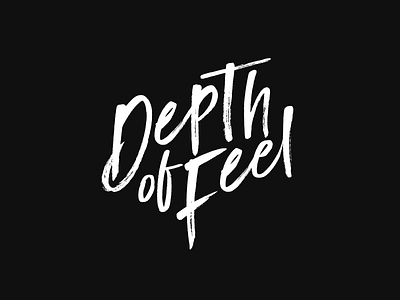
View Depth of Feel Concept 03
View Depth of Feel Concept 02
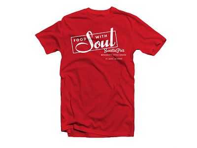
View Sweetie Pie's Food with Soul
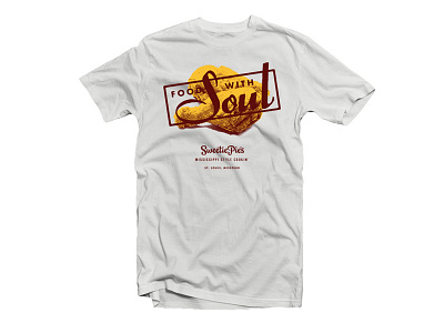
View Sweetie Pie's Chicken with Soul
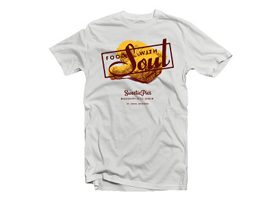
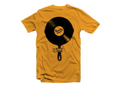
View Sweetie Pie's Cast Iron Vinyl Shirt
View Depth of Feel Concept 01
← Prev
Next →
Load more work
Loading more…